Creating Northline

Building a modern outdoor adventure brand from the ground up

Northline began as a simple idea: to create an outdoor adventure brand that felt calm, purposeful, and quietly capable. In a market often dominated by loud graphics and extreme narratives, we wanted to explore a different direction – one rooted in clarity, movement, and intention.

This project allowed us to document our full creative process, from initial concept through to a refined, functional brand identity.

Defining the Brand Direction

Before any design work began, we focused on defining what Northline stood for

Rather than positioning the brand around extreme environments or expedition culture, Northline was imagined as a companion for the long way round – for people who value direction over destination and durability over hype.

Key brand values were established early:

  • Direction and navigation

  • Quiet confidence

  • Longevity and restraint

  • Modern utility

These principles guided every decision that followed, ensuring the final identity felt authentic and intentional rather than trend-driven.

Sketching the
First Ideas

With the brand foundations in place, we moved into the sketching phase.

This stage was deliberately analogue. Working with pencil and paper allowed ideas to flow quickly without the constraints of software. We explored a wide range of concepts, focusing on:

  • Linear forms and pathways

  • Directional markers and bearings

  • Abstract interpretations of routes and movement

  • Strong typographic structures

Some sketches were loose and exploratory, others more considered. The aim wasn’t to find a solution immediately, but to uncover visual themes that aligned naturally with the Northline story.

At this stage, discussion was just as important as drawing. We reviewed what felt too familiar, what leaned too close to established outdoor brands, and where Northline could carve out its own visual territory.

Refining the Concept

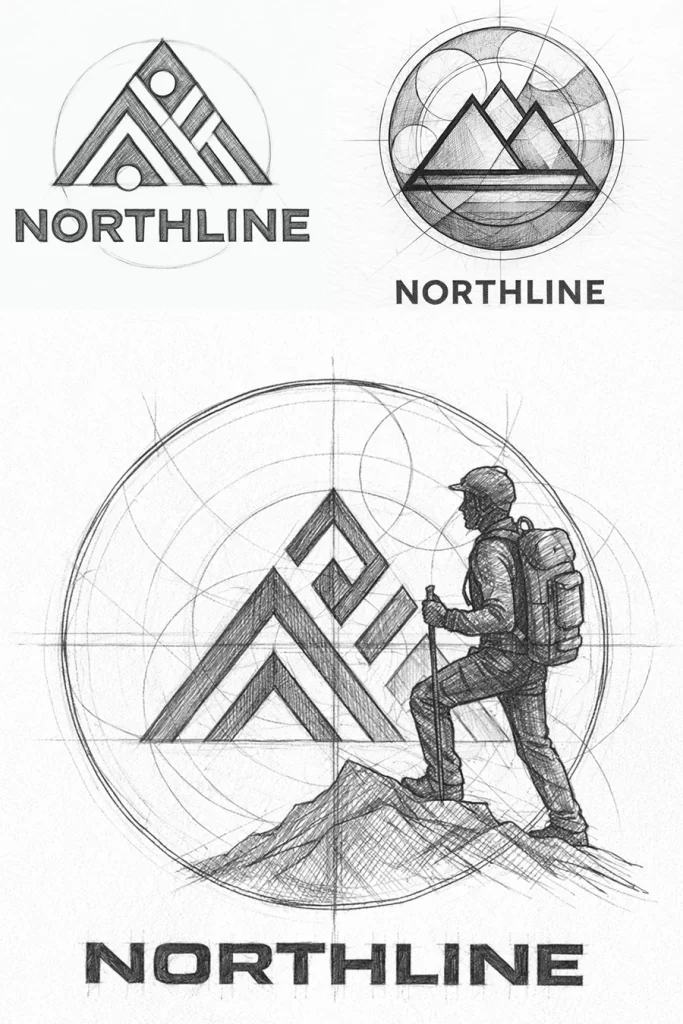
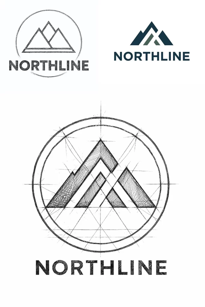
From the initial sketches, a small number of ideas were selected to develop further.

These concepts shared a common thread: simplicity, structure, and a sense of forward motion. We began refining proportions, experimenting with line weight, spacing, and balance, and testing how each idea might work across different applications.

Typography played a crucial role. We explored clean, modern typefaces with a strong sense of direction and readability, ensuring the wordmark felt confident without being aggressive.

Throughout this stage, we continually asked:

  • Does this feel calm, not loud?

  • Does it scale well across clothing and digital?

  • Does it communicate direction without being literal?